Trish Glei
← All work

Case study · HubSpot

Views 2.0: fixing what was broken before building the new feature

Three phases, 75% positive feedback on the first, and a setback in the second that taught me the most.

Company
HubSpot
My role
Solo designer and researcher
Timeline
2022
Scope
Product design · User research · Stakeholder management
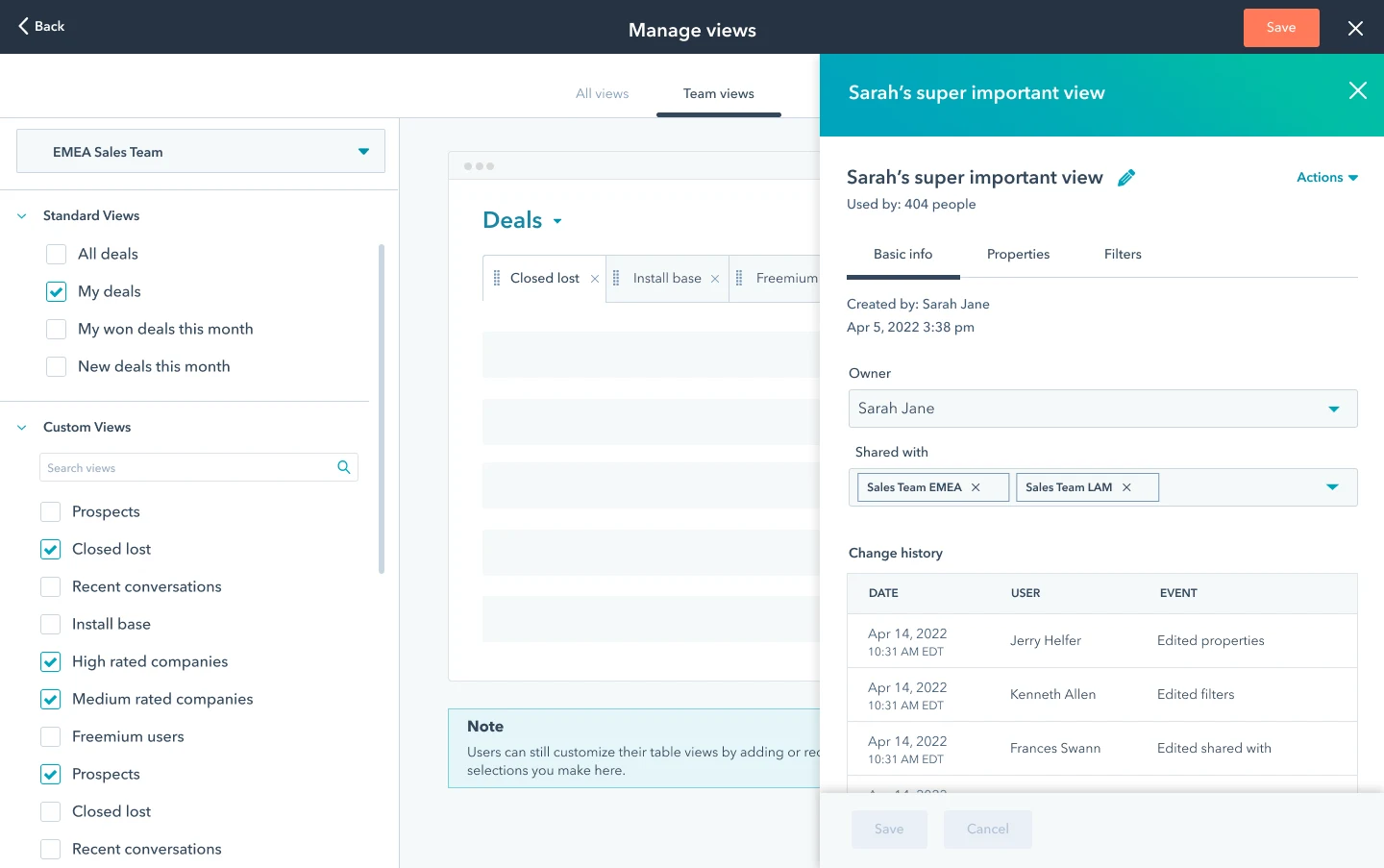
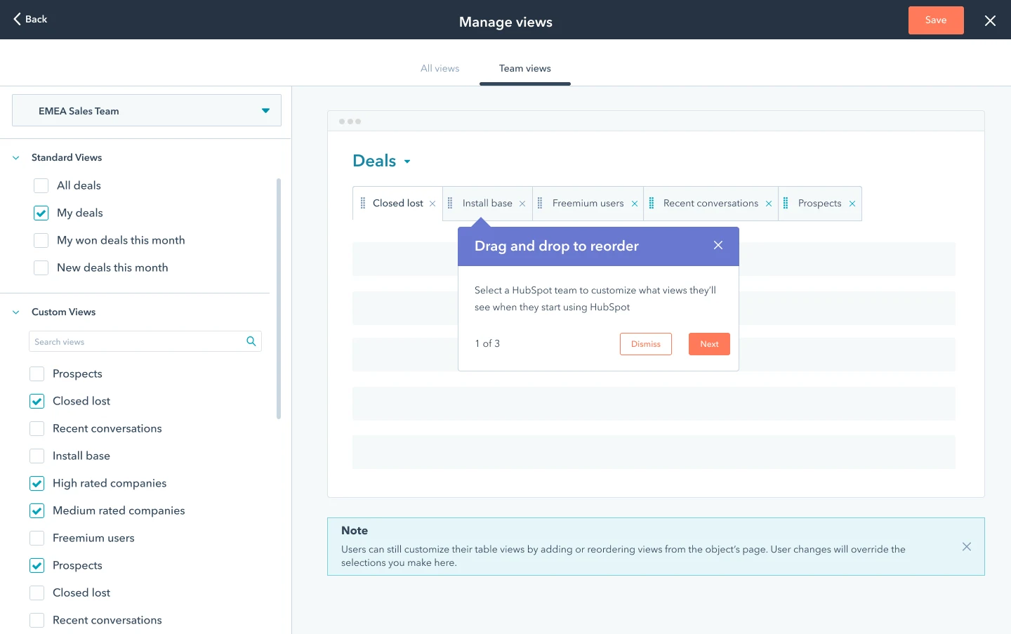
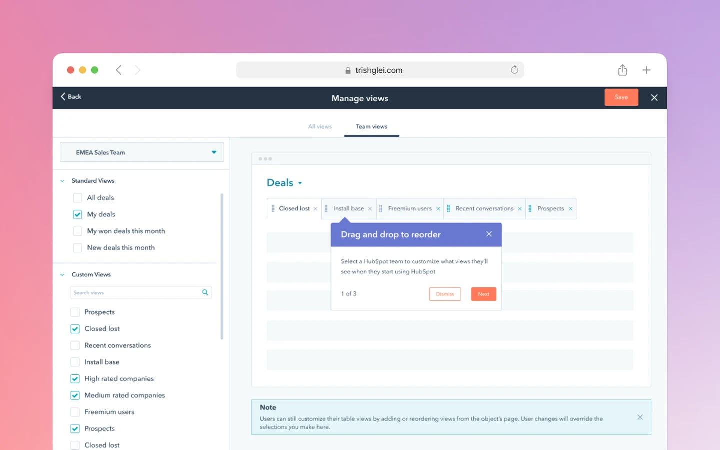
Admin screen for choosing the default views a team sees.
Outcome

75% positive satisfaction after phase one

Outcome

24% of portals using more than five views

Outcome

54% positive on admin-configured default views

01Quick context

In HubSpot's CRM, a view is a saved, filtered list of records, such as "my deals closing this month." People switch between views like tabs. Each company's HubSpot account is called a portal. The people using it fall into two groups: everyday users who just want to find a view and open it, and admins who set things up for their team.

02The problem

My team was asked to join one of HubSpot's top priorities that year, making the CRM more customizable, and to launch one new feature: letting admins choose the default views their team sees. I was the only designer and researcher, working with a product manager, a tech lead and a group of engineers, and answering to the teams behind the wider priority.

Before designing anything, I looked hard at what already existed. Customer satisfaction comments and open usability tickets pointed to the same thing: the views people already had were not working well. Many users wanted to pin more than five views. Others wanted to act on many views at once, and to see who changed a saved view, when, and what they changed.

My product manager, tech lead and I agreed we did not want to build a new feature on top of existing problems, so we defined three phases:

  1. Improve views for everyday users, starting with pinning more than five.
  2. Redesign how views are managed, to lay the groundwork for bulk actions and change history.
  3. Build the new admin feature: default views by team, for every type of record.
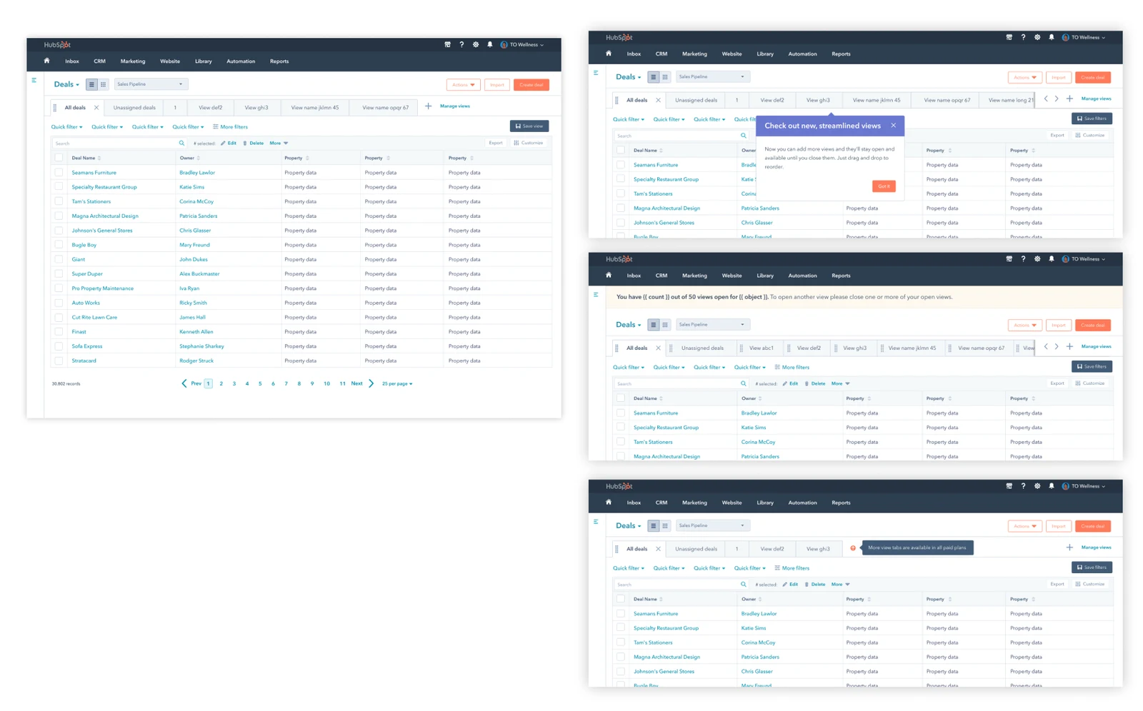
Phase 1: letting people pin more than five views.

03How I worked

I designed for two audiences. These pages serve almost every kind of user in the company, so I split them into everyday users and admins, and checked each decision against both.

Stakeholder management was half the job. I presented the plan across the whole CRM organization and shared a work-in-progress file anyone could open. I held design reviews with my product manager and tech lead, aligned every two weeks with designers on the wider CRM team, and ran a weekly critique with every CRM designer. I used visible progress and feedback loops to build trust, and data and compromise to settle disagreements.

04Phase 1: pin more than five views

This was the direct answer to the top customer request. Customer feedback was 75% positive, 20% neutral and 5% negative, with comments like I've been asking for this forever! and so much easier and intuitive. 24% of portals went on to use more than five views.

05Phase 2: redesign how views are managed

I reworked how people find and manage their views, and scoped the build to a smaller first version because of time and technical limits. This phase did not land well. Customer feedback was 72% negative, with comments like it was easier when I could see everything on the same page and I cannot find things I need, too complex to use.

I treated that as a research problem. I wanted to know why, so I set two hypotheses to test: that admins were happier than everyday users, and that larger companies were happier than small ones. I read through about 1,300 survey responses, tagged the 600 that had comments, and interviewed customers, both admins and everyday users.

The data confirmed it. 65% of admins were satisfied with the new interface, compared with 24% of everyday users. 42% of users at larger companies were satisfied, compared with 26% at small ones. The comments clustered into a few themes. By far the biggest was I just want to see everything, followed by I can't find stuff, then complaints that the page was too spread out and requests for more information on each view.

The big takeaway: we had unintentionally made life harder for the people who just want to find a view and open it. The redesign had been built around management, and those users had lost the at-a-glance list they relied on.
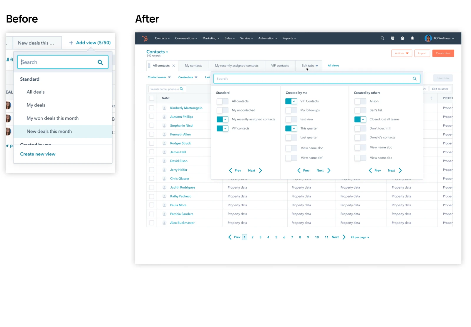
Phase 2, before and after the revision: a view picker that shows everything at a glance.

For each pain point, I proposed a fix, estimated the user impact and the engineering effort, and made a call. The quick, high-impact fixes went into the next release: an "Add view" menu that shows everything at a glance, showing all views by default regardless of who made them, select-all and clear-all controls, and filters that behave the way they do in the main table. The larger fixes, such as changes to how views are filtered by owner, needed deeper engineering work, so I recommended folding them into a bigger, longer-term project.

06Phase 3: let admins set default views

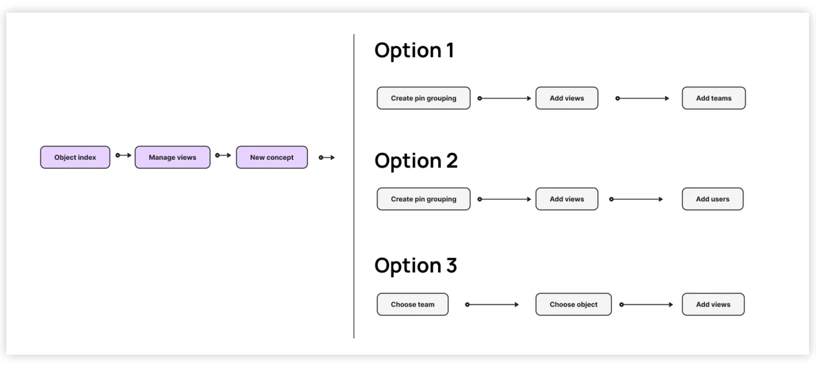
For the new admin feature, I explored three ways the flow could work, raised the fidelity of the best one, and designed the edge cases and onboarding.

Three ways the admin flow could work.

Feedback from the wider CRM team helped me cut scope, which shortened the timeline and reduced risk. We shipped a smaller first version and kept the more granular controls for later.

Phase 3: an admin chooses the default views for a team.

07The result

How customers rated each phase:

Phase 1Pin more than five views
Phase 2Redesign view management
Phase 3Admin default views
PositiveNeutralNegative
Customer satisfaction feedback after each phase shipped.
  • Phase 1: 75% positive, and 24% of portals using more than five views.
  • Phase 2: a setback. It still set the structural groundwork for bulk actions and change history, and the research behind the fixes gave the team a clear, prioritized plan.
  • Phase 3: 54% positive, 32% neutral and 14% negative, with comments like HUGE time saver. Customers asked for more granular controls, and future improvements were planned from their feedback.

08What I would do differently

Test redesigns with the people who just want to get in and out. My phase 2 work focused on the people who manage views, and the people who only use them paid for it. I would put the redesign in front of everyday users before launch, not after, and check it against the simplest task: finding a view and opening it.

Agree on what good looks like before launch. I learned phase 2 had missed from survey feedback after it shipped. Next time I would agree on success targets with my team up front, and add an earlier signal, such as a small beta, before a full rollout.